I am pretty happy with my University education. I studied Telecommunications Engineering in Spain, which is a mix of Computer Science, Electrical Engineering and Telecommunication Systems. I think it gave me a solid base for a broad range of topics, from the signals inside a circuit to software engineering principles.
However, something I have missed is some basic formation on UX and design. I think it would have helped me a lot in many of my projects. Along the years, I have valued the importance of these aspects in a project: you might have the most wonderful technical implementation of something but, I you can’t let your users understand it, you will fail.
Suitable case
The first part obvious for placing my ANAVI Thermometer in the bedroom is that it needed a case. Dust protection, protection from humans, aesthetics. ANAVI’s setup is quite convenient for development, but not as suitable for a product that is going the take part of the decoration of your bedroom.
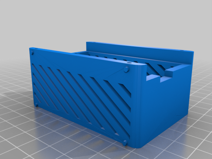
Luckily, one of the Crowdsupply field reports on ANAVI Thermometer included a printing model for a case. I hadn’t a 3D printer yet, so I ordered it to be printed using one of the apps plugged into Thingiverse, and I got a mail package with my case ready to be placed. Cool!
Matching display
A white on black OLED display was more suited for this set than the yellow and blue that came from Anavi Technology. However, when the new display arrived, I discovered it had different dimensions. It didn’t fit in the 3D printed case.
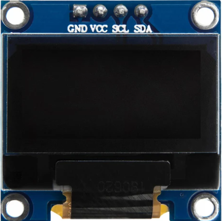
I didn’t want to order a new copy of the case. So I did an endless search for a display with the same dimensions than ANAVI’s. It was hard to find one. Finally, I found this 0.96 inch display from AZDelivery that was a perfect fit
Display reshape
I apply UX and design principles in my work, not only in product development, but also in the interfaces or the user experience of a command tool. I think the hardest but more beautiful job is making the complexity simple. I praise Apple for this. Despite I would never buy one of their products, I can admit the value and experience they used to deliver in each of them.
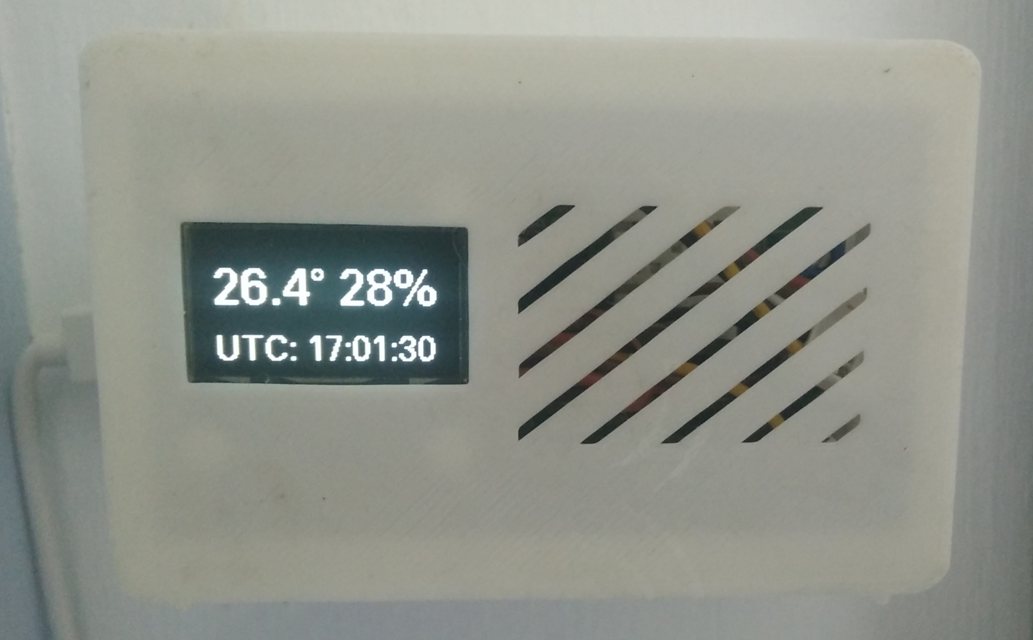
There were obvious things to cut in the original display information. Leon has done a great job creating a software that works for a lot of purposes (as we will see in the next article on the light sensor). But I am not plugging a water temperature sensor, so the Air word is not needed. The temperature unit as well, we just use Celsius. And also Humidity word, the % sign is just enough
These cuts allows increasing the font size and placing the figures in one row. I also prefer a sans-serif font, which I chose from the amazing U8g2 library.

I have published all the changes in display customization. You can find them in the display-reshape branch of my fork of ANAVI Thermometer firmware.
One Reply to “Open Bedroom Thermometer: Aesthetic Customization”