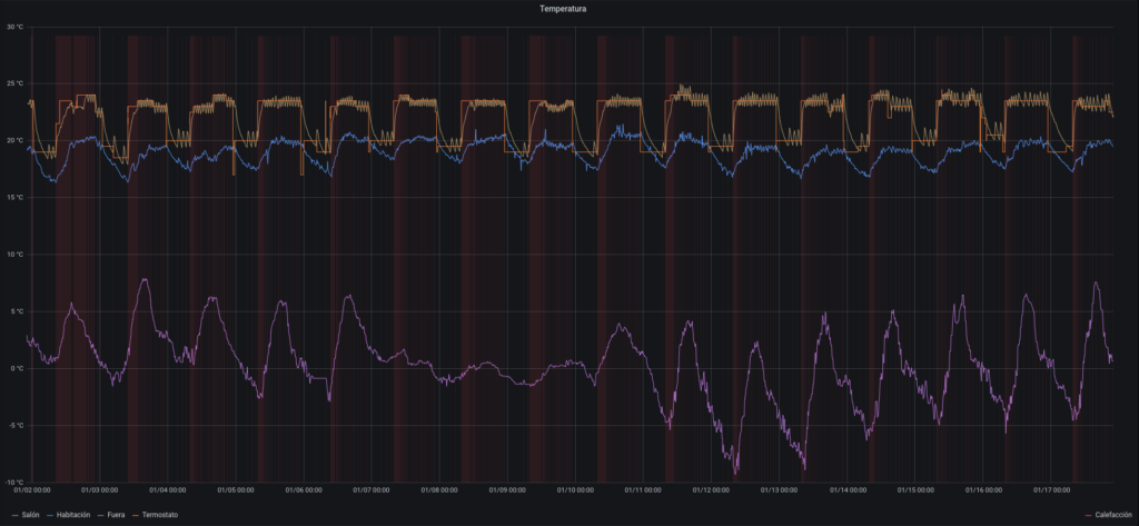
During these last days, the weather went crazy in Madrid. A great snowstorm was followed by a great freeze. It was hard for our heater to catch up. But also, a perfect scenario for learning more about what is going on with temperatures inside and outside the house!
Since the beginning, when I started with home automation and my thermostat, I had it clear that I wanted to store the data and get insights from it.
Besides, I could read about rlkoshak‘s great graphics in his How to customize a Rule tutorial, I had the way forward. In fact, rlkoshak pointed to a Grafana + InfluxDB tutorial, which I used as reference. In any case, I found some issues I wanted to share.
InfluxDB as OpenHAB persistence
InfluxDB is an opensource time series database. I found that configuring OpenHAB for storing item values is pretty straightforward!
First, you need to install the InfluxDB extension
Then, you just have to add one file to the /etc/openhab2/persistence/influxdb.persist with the items you want to store, and its frequency. For instance, I stored the items related with house temperatures, the heater working, and the thermostat temperature setpoint.
Strategies {
  everyMinute : "0 * * * * ?"
  everyHour : "0 0 * * * ?"
  everyDay : "0 0 0 * * ?"
}
Items {
  HeatingState, Temperature, OutsideTemperature, Humidity, OutsideHumidity, TemperatureSetpoint : strategy = everyChange, everyHour
}
Finally, you should define the users for database access. Besides the admin user, with full privileges, you should add a read write user for OpenHAB and a read only user for Grafana. All this setup is covered in the tutorial.
Grafana graphics
The next step, which is also covered in the tutorial, is about connecting Grafana with InfluxDB. You must use datasources for that. Then you can start building graphics.
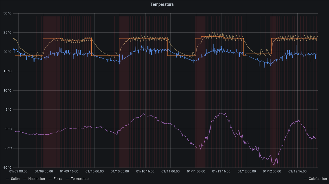
However, I had a major problem: I wanted a graphic with temperatures and heating state, but InfluxQL, the default query language, does not support value conversion. I needed the HeatingState value to be mapped from ON / OFF to 1 / 0, so it could be drawn with the temperatures.
I could achieve this creating a new number item in OpenHAB. But I though it was not OpenHAB’s responsibility to change the way it stores the data, but Grafana‘s to convert the data so it is able to draw it.
So I adopted the Flux approach: besides InfluxQL, InfluxDB supports a more advanced language that can be used to query the database and prepare the data, supporting data transformations.
Flux plugin is already distributed with Grafana, but I needed to upgrade InfluxDB to 1.8, where the Flux API is supported.
Organizations and tokens are a bit misleading as well. You don’t need an organization at all, and the token is the form user:password. Totally unexpected.
With this configuration, I could build a Flux query where I could transform the string values ON / OFF into integers. It also transforms the fields names for a better label in the graph, and groups the values by time intervals.
from(bucket: v.defaultBucket)
  |> range(start: v.timeRangeStart, stop:v.timeRangeStop)
  |> filter(fn: (r) =>
    r._measurement == "HeatingState" and
    r._field == "value"
  )
  |> map(fn: (r) => ({r with _value:if r._value == "ON" then 1 else 0 }))
  |> fill(column: "_value", usePrevious: true)
  |> set(key: "_field", value: "")
  |> set(key: "_measurement", value: "Calefacción")
I used some more tweaks to draw the HeatingState in red as temperature background.
You can see the result! I was just in time to catch the greatest snowstorm in Madrid in the last 60 years, followed by the great freeze! You can see how outside temperatures established for two days during the snowfall, and then dropped to below zero. Luckily the temperatures inside our home stayed safe!